
Gemba / Brand foundations
Clarity,
by design.
One identity. A shared language.
The foundations for everything we make.
G / 01++ 
The real place.
A clear direction.01 — 08
MIDNIGHT / MIST
A clear direction.01 — 08
MIDNIGHT / MIST
Made to feel like Gemba. From the first impression to the smallest interaction.
Identity → Design → Code01 / Identity
A mark with direction.
One symbol. Two choices: Flat or 3D for the finish, Purple or White for the colour. Choose the combination that suits the application.
01 / Finish
02 / Colour
Explore all four combinations.
Every download has a transparent background.
Breathing room
3D / WhiteDownload SVG
01
Keep its character.
Use the supplied file. Preserve its proportions, colours and the details of your chosen finish.
02
Make space.
Keep other content outside the guide shown here. The guide shown here demonstrates the spacing to leave around the mark.
03
Choose the setting.
Use a quiet background. Check the mark at the size it will actually appear.
Flat or 3D. Purple or White.
The finish
Flat
Uses solid colour areas, including lighter facets. Choose it where gradients are unsuitable, such as T-shirts and other physical items.
The finish
3D
Uses gradients to give the mark depth. Use it where those gradients and details reproduce clearly.
Application guidanceThe colour
Purple or White
Both finishes are available in both colours. Use white when contrast is unpredictable. Check the chosen colour against its background.
Choose the finish for the way the logo will reproduce, and the colour for its background. Flat / 3D and Purple / White are separate choices.
Four combinations. One identity.
Transparent artwork from the vector master. SVG stays crisp at any size; PNG is ready for everyday use.


Flat / White


3D / Purple

3D / White

02 / Colour
Quiet foundations.
A distinctive accent.
Midnight grounds the identity. Mist adds energy. White and Rock make room for the content, while Night brings depth.
Select a colour to copy its hex value. Core palette from the Gemba guidelines; the Night swatch follows the source hex value.
Background gradients.
Two ways to give a surface character. Choose the text colour with the background.
Purple Hour
A violet glow over a deep blue base. Use for dark sections with White headings and Rock body text.
background: var(--g-gradient-purple-hour);
color: var(--g-white);Flow
Light pink flows into vivid violet. White is permitted in brand graphics; use Midnight for digital copy that needs stronger contrast.
background: var(--g-gradient-flow);
color: var(--g-white);These are the approved digital gradient recipes. Purple Hour gives larger dark sections atmosphere; Flow adds a brighter accent. Apply each gradient to its own panel or section so the transition stays visible. The colours stay the same as the surface grows; the transition spreads over more space.
Pair with purpose.
Brand treatments and digital text contrast answer different questions. Use both to choose the right combination.
Permitted brand treatment
White on Mist. White on Flow.
Both belong to the Gemba identity and can be used in brand graphics. They are not prohibited pairings.
For digital text, check the colour directly behind the letters. White on solid Mist measures 2.84:1, below AA text thresholds. Use Midnight text or a darker backing where readable copy and controls need that contrast.
Recommended for digital text
✓ Recommended
White on Midnight
Headings on dark surfaces
18.10:1 · AA text✓ Recommended
Rock on Night
Body copy on deep backgrounds
12.27:1 · AA text✓ Recommended
Midnight on White
Everyday reading on light surfaces
18.10:1 · AA text✓ Recommended
Midnight on Mist
Text on accent backgrounds
6.38:1 · AA textAvoid these digital text pairings
These combinations fall below the large-text contrast threshold. Reversing foreground and background leaves the same ratio.
× Low contrast
Rock on White
Use Midnight text instead
1.61:1 · Fails AA text× Low contrast
Rock on Mist
Use Midnight text instead
1.77:1 · Fails AA text× Low contrast
Midnight on Night
Use White or Rock text instead
1.09:1 · Fails AA textEvery core colour pairing Contrast reference
| Text ↓ / Background → | Midnight | Mist | White | Rock | Night |
|---|---|---|---|---|---|
| Midnight | 1.00:1Below AA | 6.38:1AA | 18.10:1AA | 11.27:1AA | 1.09:1Below AA |
| Mist | 6.38:1AA | 1.00:1Below AA | 2.84:1Below AA | 1.77:1Below AA | 6.94:1AA |
| White | 18.10:1AA | 2.84:1Below AA | 1.00:1Below AA | 1.61:1Below AA | 19.70:1AA |
| Rock | 11.27:1AA | 1.77:1Below AA | 1.61:1Below AA | 1.00:1Below AA | 12.27:1AA |
| Night | 1.09:1Below AA | 6.94:1AA | 19.70:1AA | 12.27:1AA | 1.00:1Below AA |
Colour, in practiceA good pairing
A good pairing
works for everyone.
Mist is an accent, not body text on white. Try a combination and check its text contrast.
AaClarity makes a difference.
18.10:1AA · normal text
AA text: 4.5:1 normal · 3:1 large. This checks this colour pair, not the accessibility of a whole page.
Digital extension Supporting tones for interfaces
These interface colours are digital additions. The five core brand colours above remain unchanged.
03 / Typography
Two typefaces.
Two clear roles.
Urbanist gives prominent display headlines and graphic titles their character. Nunito Sans carries the everyday words: body text, supporting headings, navigation and controls. Both are free to download and use.
01 / Display titles
Urbanist
For prominent headlines and designed graphics.
Regular / 400
Good things start here.
Bold / 700
Better, together.
Italic / 400
A clearer way forward.
Live type · Genuine regular, bold and italic
- Hero headlines, campaign titles and graphic titles
- Display type in presentations and social graphics
02 / General purpose
Nunito Sans
For written content and digital interfaces.
Regular / 400
Good things start here.
Bold / 700
Better, together.
Italic / 400
A clearer way forward.
Live type · Genuine regular, bold and italic
- Body copy and everyday documents
- Supporting website headings, buttons and navigation
In practice
A campaign graphic or prominent webpage headline uses Urbanist. Its explanation, supporting headings and buttons use Nunito Sans. The large section titles in this guide demonstrate Urbanist; the interface uses Nunito Sans.
Both specimens use the actual fonts, loaded by this site. Downloads include desktop fonts, webfonts and their open licences. Existing logo lettering remains supplied artwork; do not retype it.
DISPLAY / 64Make it clear.
clamp(2.75rem, 5vw, 4rem)HEADING / 40A shared direction.
2.5rem / 1.15 / 700BODY / 16
Say what matters. Keep each sentence useful. Use plain language and let the next step be obvious.
1rem / 1.65 / 400LABEL / 12A small detail. A clear purpose.
0.75rem / 1.5 / 700Use the right source. Keep supplied logo lettering as artwork. The display sample uses Urbanist; the supporting heading, body and label samples use Nunito Sans. Both font downloads are free under the SIL Open Font License.
04 / Language
A shared language.
A clearer journey.
Our metaphors give words and imagery the same meaning. The client owns the journey; Gemba helps them see more clearly and find a way forward.
Clear before clever.
Use a metaphor when it makes an idea easier to understand. Connect it to something practical: a vision, a review, a decision or a next step.
A guide, alongside the client.
Be curious, direct and grounded. Help people see possibilities and make informed choices. Keep their experience and ambition at the centre.
One idea at a time.
There is no need to fit every metaphor into every message. Let the language support the work, and use the same meaning in words and images.
05 / Composition
Space is part
of the system.
A consistent rhythm helps the eye find its way. Use a four-pixel base, an eight-pixel cadence and a clear distinction between content and controls.
4px
8px
12px
16px
24px
32px
48px
64px
Room to focus.
Group related elements. Separate different ideas. Use borders to organise, and shadows only when depth conveys meaning.
Change the example’s spacing.
A useful next step
Better, together.
Create space for the conversation.
Keep the next action in focus.
Layout
Flexible columns. Readable line lengths. One column when space gets tight.
Shape
8px for controls, 12px for panels, 20px for larger visual surfaces.
Motion
160–240ms. Explain a change. Respect reduced-motion preferences.
Imagery / Brand foundation
A sense of direction.
The summit gives us a vision. Landmarks invite reflection. The trail connects past, present and future. Light represents Gemba’s guidance: helping clients see what was previously hidden. Keep text clear of busy detail.
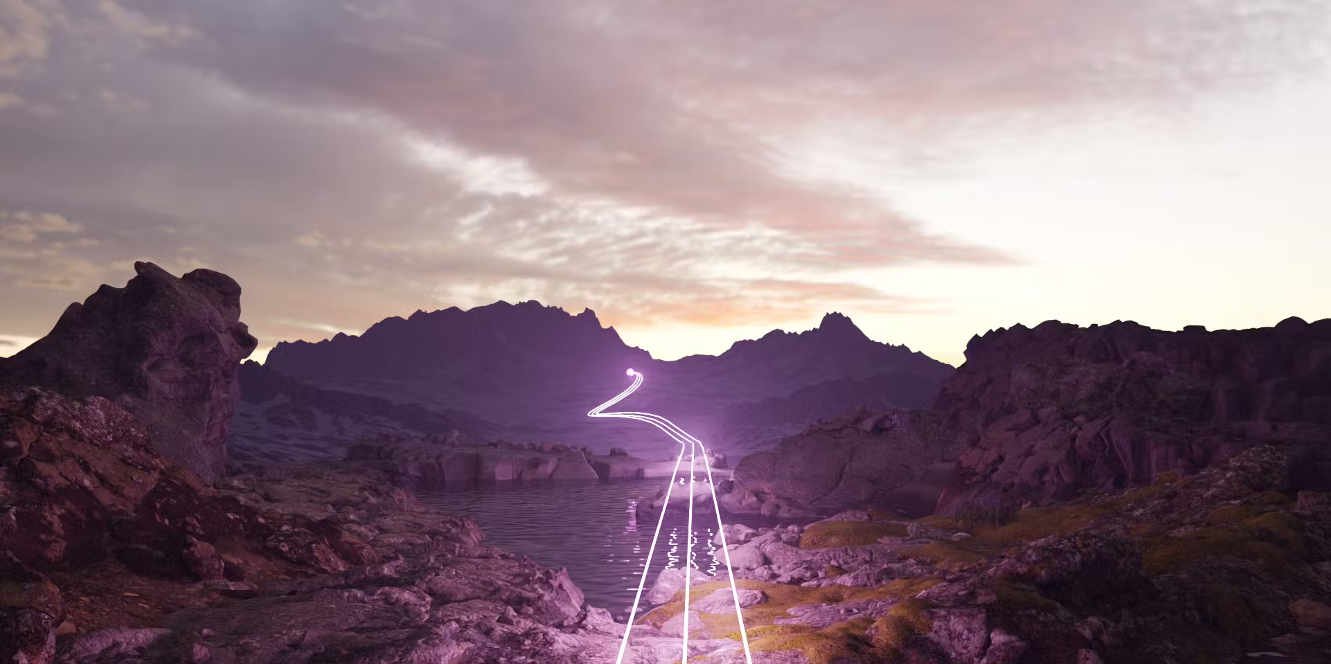

Original Gemba imagery. Real project and event photography can also show the work in context.
06 / Components
From a rule
to a real interaction.
A small set of well-considered elements. Explore the states, inspect the CSS and use the same tokens in your own work.
LIVE PREVIEWOne primary action. A clear next step.
CSS
Designed to be used. Visible focus, clear labels, 44px controls and a reduced-motion alternative are part of the component design.
07 / Development
The design,
expressed in code.
Start with the tokens. Give each colour a job. Keep values in one place so the interface stays consistent as it grows.
01 / BRAND VALUE
→#1B112AMidnight02 / SEMANTIC TOKEN
→--g-inkPrimary text03 / COMPONENT
color: var(--g-ink)Intent in the implementationA small, portable starting point.
Plain CSS variables. No framework dependency. Use the same values in an Astro page, a component library or a small standalone tool.
- 1Download and include
tokens.css. - 2Use semantic tokens in components.
- 3Check every state and screen size.
your-component.css
@import url("./tokens.css");

.panel {
  color: var(--g-ink);
  background: var(--g-white);
  padding: var(--g-space-8);
  border: 1px solid var(--g-border);
  border-radius: var(--g-radius-md);
}

.panel a:focus-visible {
  outline: 3px solid var(--g-focus);
  outline-offset: 4px;
}
Token reference Core values and semantic roles
| Token | Value | Use |
|---|---|---|
--g-midnight | #1B112A | Primary ink and dark surfaces. |
--g-mist | #D175E6 | Brand accent. White is a permitted brand treatment; Midnight gives stronger digital text contrast. |
--g-white | #FFFFFF | Titles and text on dark surfaces; also permitted on Mist and Flow in brand graphics. Check digital text contrast separately. |
--g-rock | #CCCCCC | Neutral support and decorative elements. |
--g-night | #080820 | Deep backgrounds and high-contrast compositions. |
--g-ink | #1B112A | Primary text, mapped to Midnight. |
--g-canvas | #F8F7FA | Quiet page background. |
--g-muted | #665D70 | Supporting text on White or Canvas. |
--g-border | #E5E0EB | Decorative separators; use stronger outlines for input boundaries. |
--g-action | #79259B | Links and filled actions with White text. |
--g-action-hover | #642080 | Hover state for the Action colour. |
--g-focus | #79259B | Focus ring on light surfaces; use Mist on dark surfaces. |
--g-subtle | #F0EAF5 | Selected and supporting surfaces. |
08 / Assets
Take it from here.
The essentials for your next Gemba project. Original artwork, freely available fonts and the digital tokens used throughout this guide.
Gemba logo collection
ZIP · 4 SVG vectors + 4 transparent PNGsCSS tokens
Brand + digital extension · CSSDesign tokens
Structured values · JSONIndividual logo files
SVG is scalable vector artwork. PNG is a transparent image. Choose the format directly here.
Flat / Purple.svg vector ↓.png image ↓
Flat / White.svg vector ↓.png image ↓
3D / Purple.svg vector ↓.png image ↓
3D / White.svg vector ↓.png image ↓
Urbanist
Display titles · desktop + webfonts · open licenceNunito Sans
Everyday words · desktop + webfonts · open licenceAbout this edition
This is the master reference for the Gemba identity: logo artwork, colour, typography and the design rules for everything we make.
Digital edition 1.0 / November 2026